Visual
Analytics and Imaging Laboratory (VAI Lab) Computer Science Department, Stony Brook University, NY |
Visual
Analytics and Imaging Laboratory (VAI Lab) Computer Science Department, Stony Brook University, NY |
Abstract: Climate
research produces a wealth of multivariate data. These data often have a geospatial
reference and so it is of interest to show them within their geospatial context.
One can consider this configuration as a multifield visualization problem,
where the geo-space provides the expanse of the field. However, there is a
limit on the amount of multivariate information that can be fit within a certain
spatial location, and the use of linked multivariate information displays
has previously been devised to bridge this gap. In this paper we focus on
the interactions in the geographical display, present an implementation that
uses Google Earth, and demonstrate it within a tightly linked parallel coordinates
display. Several other visual representations, such as pie and bar charts
are integrated into the Google Earth display and can be interactively manipulated.
Further, we also demonstrate new brushing and visualization techniques for
parallel coordinates, such as fixed-window brushing and correlation-enhanced
display. We conceived our system with a team of climate researchers, who already
made a few important discoveries using it. This demonstrates our system’s
great potential to enable scientific discoveries, possibly also in other domains
where data have a geospatial reference.
Teaser: Some screenshots of
our system:
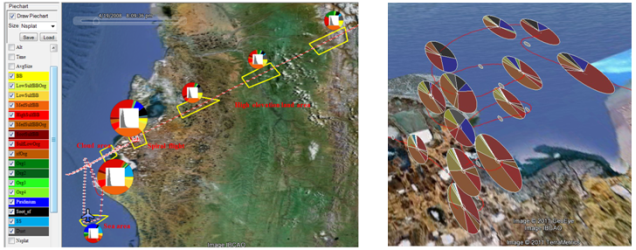
(Left) An overview of particle compositions and size changes
along the flight. The flight track is marked as a red line and each of the
one-minute-spaced data points is superimposed as a grey ellipse. The polygon
selection tool is used to outline several interesting areas (indicated by
yellow polygons and labeled in red) and the corresponding distriibution iconsare
drawn nearby. (Right) Changes in particle composition as a function of altitude.
We zoom into the flight’s spiral ascent, where the aircraft climbed
from a few hundred meters to an altitude of about 7000 m. The pie charts clearly
illustrate that particle compositions change significantly with altitude and
that the
changes are not monotonic.
Video: Watch to see the system in action:
Paper: Z. Zhang, X. Tong, K. McDonnell, A. Zelenyuk, D. Imre, K. Mueller. "An Interactive Visual Analytics Framework for Multi-Field Data in a Geo-Spatial Context," Tsinghua Science and Technology on Visualization and Computer Graphics, 18(2), April, 2013.pdf
Funding: NSF
grant IIS 1117132, a Brookhaven National Lab LDRD grant, and by the US Department
of Energy (DOE), Office of Basic Energy Sciences, Division of Chemical Sciences,
Geosciences, and Biosciences.